Category: Workplace Solution of the Year 2018
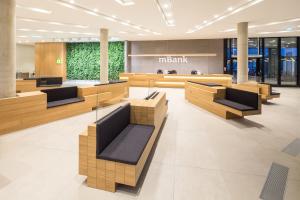
Space arrangement reflects institution's character which means it is comfortable, modern and friendly - these were our design directives. In addition, technological and IT solutions integrated into arrangement emphasize mobility and innovativeness of organization. Spacious main hall with warm, elegant interior and natural finishing, announces a theme of whole programme. The parts of furniture made of natural veneer guides guests to the reception. Navigation consistent with the design of an office simplifies reaching destination. Conference space, opened for external customer was created as smart and allude to the tradition of the town of Łódź, especially using raw materials and display windows. As a result of competition, several floors were designed thematically. The topic (colors of the World, a town, mobility, nature, film) appears in meeting rooms, wall units and rooms with special interior finishing. The repetitive element on every office floor is central zone, enabling diversity in working. Thanks to the applied branding, employees can identify more with the institution. Branding elements and colors – as a key mark of every large organization – are not intrusively used in logotype on furniture, details and wall laminating, but give straight message about type of space. An important step to make bond between employees and brand was permitting them to create some meeting rooms by themselves.
Tenant mBank |
Type of tenant's business operations/industry financial sector services |
Location of the office Przystanek Mbank, Lodz, ul. Kilinskiego 74 |
Date of completion 28.09.2017 |
Author/s of the architectural design InDesign Zbigniew Kostrzewa |
General contractor Ghelamco Poland Sp.z.o.o. |
Total area 26 335 m2 |
Useable area 24000 m2 |
Number of floors 5 |
|
Information about the architect/architectural studio
InDesign offer complex corporate interior design services as well as workplace research, full range of services, create spaceplans, detailed design in cooperation with multi – branch specialists. Create commercial design (branding) as well as custom designed furniture, industrial and graphic design.
|
|
Descritpion of individual work stations
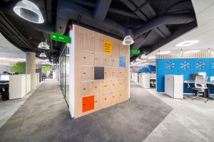
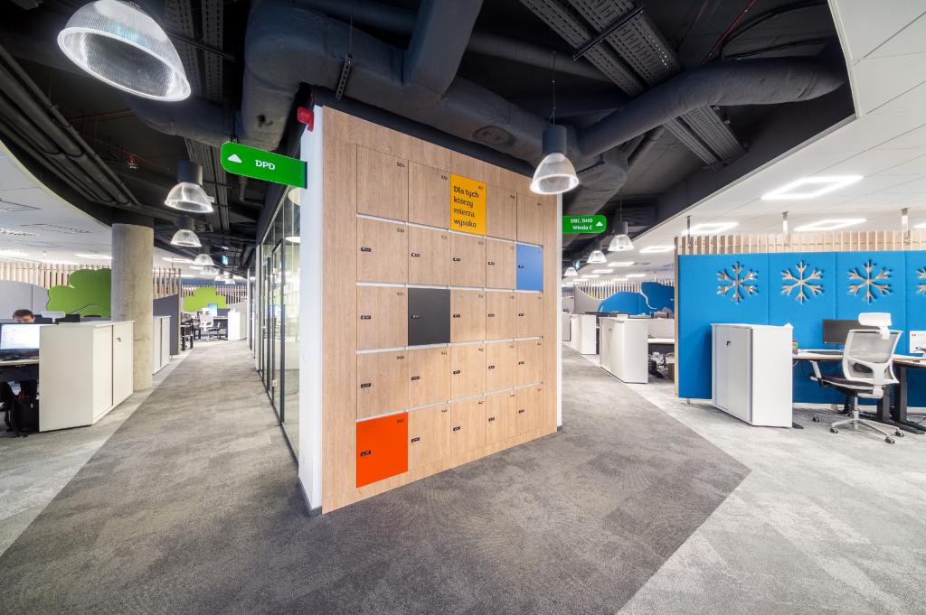
The main proposition is a workstation in a desk-sharing system. Flexibility to choose a workstation and ability to move between them is provided by, evenly distributed through all floors, locker system designed to store individual belongings. The height of the desk in the desk-sharing system can be adjusted using electric motors and transformed into standing desk. The desks are equipped with upholstered partitions providing acoustic and visual comfort.
|
|
Description of the area designated for creative work
The space is divided into several types:
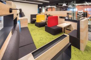
1. Space for ad-hoc work dividing individual work zones with high tables with hoker chairs or standard height tables. The ad-hoc space occurs alternately with unformal work space with beanbags and soft seating.
2. Space situated in the center area of the floor has five types of stations designed for creative work each station is designed individually:
a. Upholstered seating with countertop and desk lamp
b. High countertop with hoker chairs
c. Round table
|
|
Description of relaxation area
The space is divided into several types:
1. Separated zones on open-space with upholstered soft seating and beanbags
2. Loosely distributed soft seating next to tearooms
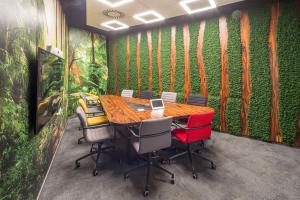
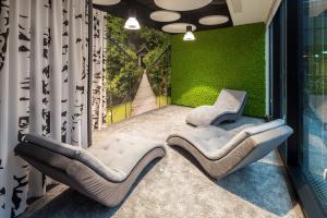
3. Meditation zone with lounge chairs and green wall
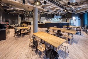
4. Evenly distributed upholstered seating next to cafeterias.
5. Game room with TV, game console and foosball table
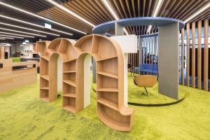
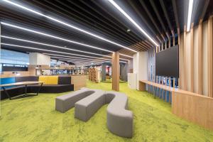
6. Central space with designed sitting modules and varied types of loosely distributed seating furnitures.
|
|
Materials, furnishing elements and technology used
Drywalls and fully glazed walls single and double glazed. Linings: white tempered glass,laminated recess,veneered cladding,green living walls,walls with self-preserving vegetation (moss and lichen),concrete.Island mineral ceiling, modular, laminated in the form of pergolas and free-hanging, ceiling and installations uncovered in part of communication.Flooring made of wood-like PVC panels,carpets with different plating lengths according to acoustic requirements and underlining of functional zones
|
|
Office furnishing/furniture
Bench work stations with adjustable height, soundproofed by upholstered walls. The design of the informal work zone on each floor are free-standing elements constituting a visually consistent part that is the hallmark of the organization containing colors, shapes and logos. A conference area designed refering to a industrial part of Polish city Łodź but in a representative form. The reception counter is also a reference to the central zone on the floors in a simpler elegant form.
|
|
Ecological and energy efficient features
The building was certified by BREEAM and was constructed in the A + class. Ecological solutions beyond the whole package that meets the above mentioned certificate include segregation of garbage, use of natural materials such as concrete, wood, veneer. LED light sources and division of circuits allowing for optimal lighting of workplaces were used.
|
|
Greenery in the office (selection of plants, patios, terraces)
Greenery designed in the form of living green walls with carefully selected vegetation,walls with self-preserving vegetation, potted vegetation on the terrace, green roof with various species of succulents and grasses, incorporation in the patio of the building greenery in the form of a newly-planted tree and covering the air vane with the vines, and connecting them with vegetation winding along the rails of the internal atrium (project of external greenery out of scope of works).
|
|
Description of the interior from an architectural point of view (office attractiveness, design)
Space arrangement reflects institution's character which means it is comfortable, modern and friendly - these were our design directives. In addition, technological and IT solutions integrated into arrangement emphasize mobility and innovativeness of organization. Spacious main hall with warm, elegant interior and natural finishing, announces a theme of whole programme. The parts of furniture made of natural veneer guides guests to the reception. Navigation consistent with the design of an office simplifies reaching destination. Conference space, opened for external customer was created as smart and allude to the tradition of the town of Łódź, especially using raw materials and display windows. As a result of competition, several floors were designed thematically. The topic (colors of the World, a town, mobility, nature, film) appears in meeting rooms, wall units and rooms with special interior finishing. The repetitive element on every office floor is central zone, enabling diversity in working. Thanks to the applied branding, employees can identify more with the institution. Branding elements and colors – as a key mark of every large organization – are not intrusively used in logotype on furniture, details and wall laminating, but give straight message about type of space. An important step to make bond between employees and brand was permitting them to create some meeting rooms by themselves.
|
|
Description of the interior in terms of its functionality and the optimisation of the office space
Object was equipped with all necessary functions like customer service, registrar's office, café, two cafeterias, training and conference centre, medical station and LAB (development of new technologies centre).
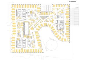
Because of large 4500 sqm area, functions concentrate near each of three cores, which provides equal distance to essential places like kitchenette, copy point, wardrobe, meeting rooms, quiet rooms or phone booths for every employee. Light condition, shape and depth of a bay generated central point on a plan, which focus characteristic creative working spots and informal, meeting spaces. In relation to the concept of desk sharing, lockers and filing cabinets are evenly distributed throughout the whole working area. The space is constantly optimized and adapts to the needs of the employees, giving them the freedom of relocation. Open space is modular, divided with chillout zone or ad hoc working place every four seats. Muffling wall units partition an open area, which is also a placement of floor's thematic icons. Supplement of the design is equipping an area with modern IT technologies, which facilitate internal communication and exchange of information.
|
|
Additional information and justification why this project deserves to be rewarded
Project is a result of analysis, working environment studies and workshops. It responds to customer's needs, which was confirmed by feedback and employee satisfaction surveys. All of the proposed informal spaces are necessary and utilized. The major information identifying a good project is a fact, that office became a showcase, changed a quality of working environment and established an achieved standard for future localizations, successfully used also outside of Poland.
|
 Polski
