Category: Eco- and User-Friendly Facility of the Year 2018

The idea of architecture allowing users frequent and direct contact with greenery and water, and providing a comfortable and attractive usable space has become the starting point in the design of the complex.
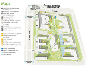
An important aspect in shaping the layout of both the buildings and the garden was also defined by the complex’s location within the air circulation corridor. This was what strongly influenced the linear way of setting up office buildings along ul. Żwirki i Wigury and the streamlined shape of the building in the central part of the garden. The green character of the area of the former allotments has also been preserved, creating a park between the detached buildings of the complex.
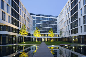
A distinctive feature of the project is that the buildings look different from outside the complex, i.e. from the street, than from inside it, form the garden. Viewed from the street, they present calm modernist architecture with simple façades. The garden-facing walls are rounded with rows of deep wings – breaks. Although each building was designed individually, by a different group from the designer team, despite the differences between them all the façades for a uniform whole from the outside. All buildings were given a certain uran-development and colure-scheme regime, which resulted in the creation of a coherent composition. This is harmonized, timeless architecture growing from the tradition of modernism, structural and logical in expression.
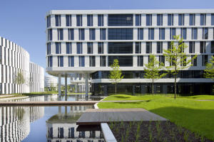
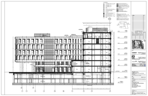
The two buildings located along Ilżecka Street have different projections but were built in exactly the same way and have a uniform outer form. The front walls of these buildings have a distinct two-storey plinth segment. The upper storeys have a wall with windows whose position alternates every other floor. This has allowed any monotony of the whole façade to be avoided. From the garden, deep wings breaks with gently rounded corners add variety to the buildings. These wings are lower (by one storey) than the main body from the street side, which has enabled gardens to be set up on the roofs. Their distinctive feature is a prominent overhang of some of the wings on thin, two-storey columns growing straight out of the water of a long pool.
There are also three rear wings and a disciplined rectangular body form the Żwirki i Wigury Street site in the building located on the other end of the complex. The façade here has been designed much more conventionally. These are simply strips of windows stretching around the frontage. To add diversity, their height is different in different sections.
Ellipses dominate in the next building in the middle of the garden. Essentially, these are two separate buildings connected by a shared glazed basement. Again, the façade of the building features a rhythm of windows defined by thin pilaster strips on the wall. However, their rhythm is broken.
The last building marks the complex’s boundary from the allotment side. Built on a rectangular plan, with horizontal ribbons of windows, it doesn’t attract attention with any special elements, but this was the designers’ intention, as they wanted to avoid making the architecture too “garrulous”.
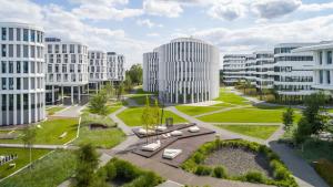
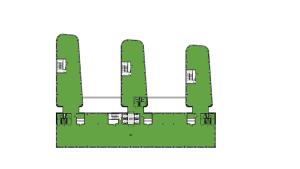
The buildings are situated in a garden designed on a trapezoidal plan on the vast area of a 6 hectare plot.
Name of building Business Garden II |
Location Żwirki i Wigury 14-16 |
Date of completion 15-01-2017 |
Author/s of the architectural design J.S.K. Architekci |
Investor Vastint Poland |
Developer Vastint Poland |
General contractor Hochtief Polska |
Standard of the building A |
Facility's website http://www.businessgarden.pl/business-garden-warszawa-kompleks-biurowy/ |
Total area 102 000 |
Useable area 56000 m2 |
Office area 56000 m2 |
Cubic volume 1 m3 |
Height 1 m |
Number of above-ground floors 7 |
Number of underground floors 2 |
Number of parking spaces 977 |
number of lifts 4 |
|
Type of facility - basic and additional functions
Five office buildings surrounded by a garden, which comprise phase II of the office complex. 95% of the space is occupied by offices, the remaining 5% by additional functions.
|
|
Information about the architect/architectural studio
J.S.K. Architects is an international team, which is based on many years of professional experience gained primarily on the German and Polish market. The studio is distinguished not only by finding individual design solutions but also by special care for the quality of their implementation.
|
|
Description of the façade (type of finishing, materials used)
When designing the complex, the principle was adopted that the external façade s of buildings from the plot's boundary side have simple lines and forms that give the whole a disciplined framework, while the façades facing the garden and elevations of buildings located in the middle of the complex are smooth, using curves, ellipses, wavy lines. The white façade s were covered with metal panels, while the middle parts of the basement were accentuated with a kind of deep portico, supported on simple pillars covered with stone
|
|
Details of the parking facilities (underground / above-ground)
The number of parking spaces located on the ground has been deliberately limited to maximize the garden area. Most parking spaces were located in underground garages.
|
|
Obtained certificates eg BREEAM, LEED, GBS, DGNB, HQE. Level of certification / number of points earned / type of certificate / date obtained.
Certification system LEED, type of certification Core and Shell (v2009), certification level Platinum, average number of points for 5 buildings 86/110, certificate was received May 25, 2017
|
|
Description of the facility from an architectural point of view
The idea of architecture allowing users frequent and direct contact with greenery and water, and providing a comfortable and attractive usable space has become the starting point in the design of the complex.
An important aspect in shaping the layout of both the buildings and the garden was also defined by the complex’s location within the air circulation corridor. This was what strongly influenced the linear way of setting up office buildings along ul. Żwirki i Wigury and the streamlined shape of the building in the central part of the garden. The green character of the area of the former allotments has also been preserved, creating a park between the detached buildings of the complex.
A distinctive feature of the project is that the buildings look different from outside the complex, i.e. from the street, than from inside it, form the garden. Viewed from the street, they present calm modernist architecture with simple façades. The garden-facing walls are rounded with rows of deep wings – breaks. Although each building was designed individually, by a different group from the designer team, despite the differences between them all the façades for a uniform whole from the outside. All buildings were given a certain uran-development and colure-scheme regime, which resulted in the creation of a coherent composition. This is harmonized, timeless architecture growing from the tradition of modernism, structural and logical in expression.
The two buildings located along Ilżecka Street have different projections but were built in exactly the same way and have a uniform outer form. The front walls of these buildings have a distinct two-storey plinth segment. The upper storeys have a wall with windows whose position alternates every other floor. This has allowed any monotony of the whole façade to be avoided. From the garden, deep wings breaks with gently rounded corners add variety to the buildings. These wings are lower (by one storey) than the main body from the street side, which has enabled gardens to be set up on the roofs. Their distinctive feature is a prominent overhang of some of the wings on thin, two-storey columns growing straight out of the water of a long pool.
There are also three rear wings and a disciplined rectangular body form the Żwirki i Wigury Street site in the building located on the other end of the complex. The façade here has been designed much more conventionally. These are simply strips of windows stretching around the frontage. To add diversity, their height is different in different sections.
Ellipses dominate in the next building in the middle of the garden. Essentially, these are two separate buildings connected by a shared glazed basement. Again, the façade of the building features a rhythm of windows defined by thin pilaster strips on the wall. However, their rhythm is broken.
The last building marks the complex’s boundary from the allotment side. Built on a rectangular plan, with horizontal ribbons of windows, it doesn’t attract attention with any special elements, but this was the designers’ intention, as they wanted to avoid making the architecture too “garrulous”.
The buildings are situated in a garden designed on a trapezoidal plan on the vast area of a 6 hectare plot.
|
|
Description of the lighting in the building / access to natural light
Over 90% of the space in the building is characterized by a high level of access to natural light, thanks to which the need to use electric lighting has been reduced. Energy-efficient lighting was installed (LED lighting fixtures) with an automatic control system by time programmers and motion detectors that shut off unnecessary lighting in parts of unused rooms and controlling the lighting of the outdoor area (system KNX).
|
|
Solutions to minimise harmful emissions into the atmosphere (heating, air conditioning, the ventilation system)
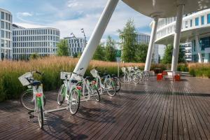
The complex promotes alternative means of transport, offering tenants free bicycle hire, changing rooms for cyclists and charging points for electric cars.
|
|
Energy-efficiency / Is there and in what way has the renewable energy been used in the building?
n/a
|
|
Water saving solutions
Among the discussed solutions, one should distinguish the introduction of a comprehensive rainwater management strategy. The water does not flood the pavements in the middle of the team, but just like in the meadow, it soaks into the soil. It is stopped by plants, and its excess goes to tanks, both closed with water intended, among others, for watering the garden, as well as open pans, which every day make the impression of dry ponds that are an additional decoration of the garden. In the park there are also decorative tanks that change the microclimate of this place. The high quality of water in these reservoirs is maintained thanks to constant circulation through a treatment station located in the underground part of the complex. In addition, rainwater is retained on roofs overgrown with vegetation. It is anticipated that the above solutions allow to reduce the outflow of rainwater from the area by over 60%.
|
|
Description of the greenery in the building (the variety of plants, such as on green terraces or patios)
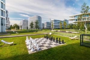
The most noticeable thing as soon as you enter the garden is its spaciousness, the varied terrain featuring hillocks as well as reservoirs from which some of the buildings seem to emerge. The inner area of the garden is made “civilized” by small architectural elements: gravel paths or wooden walkways, wooden terraces, benches and angular low walls at the edge of the ponds. In contrast to the diverse greenery inside the complex, the external area was economically managed, referring to the typical urban style.
The garden’s diverse vegetation includes tall trees (oak, birch, honey locust), rows of park shrubs (Japanese cherry), year-round grasses, carefully tended lawns serving as a reminder that we are in a park and partially evergreen perennials (calamgrostis, festuca, helictotrichon sempervirens, stipa) and meadow vegetation (iris, hemerocallis, cares, juncus, Phragmites, Miscanthus).
|
|
Landscape architecture / incorporation of the building into greenery
Years ago, allotment gardens were closed here, now passers-by can easily use the garden between free-standing buildings. The city has gained a new, public space. Designed in a thoughtful way, the garden works great as a place for outdoor events. And the hotel, conference centre, restaurant, art gallery and fitness club are visited by both city residents and employees of the complex
|
|
Were recycled materials used during the construction of the building?
It is also worth mentioning the issue of the sustainable selection of materials. Over 30% (according to costs) of building materials used in buildings were recycled, while 50% came from the region, thanks to which reduction of greenhouse gas emissions generated by transport to the construction site was ensured. The materials used are characterized by a low VOC coefficient, while wood used for the construction of terraces is certified by the FSC.
|
|
Features specifically for users (e.g. noise minimisation, relaxation zones, electric car charging stations)
The complex includes above-ground and underground charging stations for electric cars and parking lots for cyclists, there are rooms with showers and cabinets as well as bicycle repair stations at their disposal. Tenants can rent bikes for free and use a professional service during Bike Days.
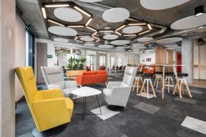
The garden allows employees of the offices located here not only for a moment of breathing, but also, depending on the type of work, to move with a laptop to the lawn or garden bench.
|
|
Animal-friendly facilities (e.g. bird boxes, hives)
The installation of hotels for insects and bird houses is planned.
|
|
Solutions creating pro-ecological behavior among tenants
Together with tenants, we carry out tree planting campaigns, an office waste recycling system has been implemented, every year an electro-waste collection is organized.
|
|
Innovative solutions
One innovative solution was using the DELTABEAM © system as an element of the composite structure, thanks to which the floor surface could be “clean”, i.e. with no visible support beams.
A solution that significantly augmented the whole complex’s innovative character was the introduction – where the work was already in progress – of the prefabrication method.
|
|
Additional information and justification for why the building deserves to be rewarded
Architecture immersed in garden greenery leaves no one indifferent. Park between office buildings, carefully designed and implemented is a public space that is generally available as a part of one of the most interesting office projects in Warsaw. As for its users and all of Warsaw’s residents, it helps them realize that we can and must build ever better possible conditions for work and leisure.
|
 Polski
